Ohio State Fair – Funky Food (September 2, 2015)
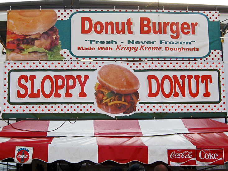
One of the strangest things at the Ohio State Fair is the range of odd ‘fair food’ items. The grossest one that I saw was the Sloppy Donut. I really could not order one to see what is actually looked like but the photo tells it all. Two Krispy Kreme donuts as a bun with sloppy joe mix in between. I never saw anyone order this. I cannot imagine anyone buying this.
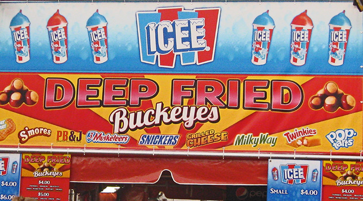
The second ‘fair food’ that I found totally odd was the deep fried buckeyes. Buckeyes are the desert treat of peanut butter covered in chocolate. They take these buckeyes and then deep fry them. They will also deep fry a lot of other commercial treats like twinkies, snickers bars, pop tarts, or a grilled cheese sandwich. Strange – I guess it is a novelty item that might appeal to teenagers.
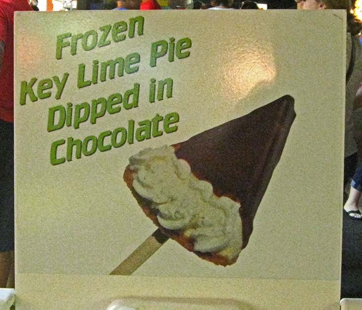
Finally, another vendor freezes a slice of key lime pie and then dips it in chocolate and serves it on a stick – very weird.


more
Ohio State Fair 2015 (August 25, 2015)
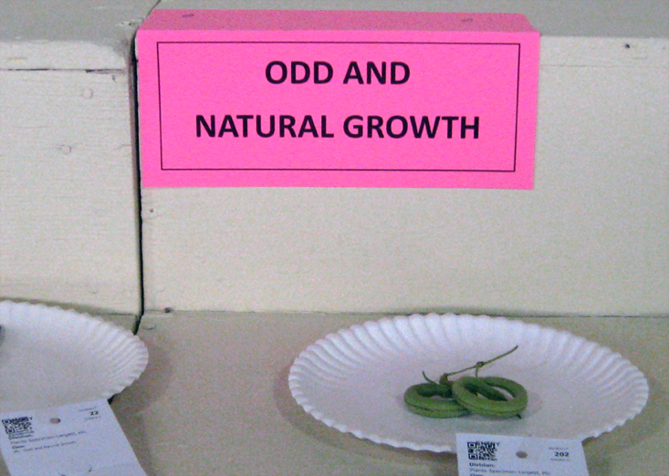
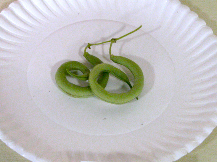
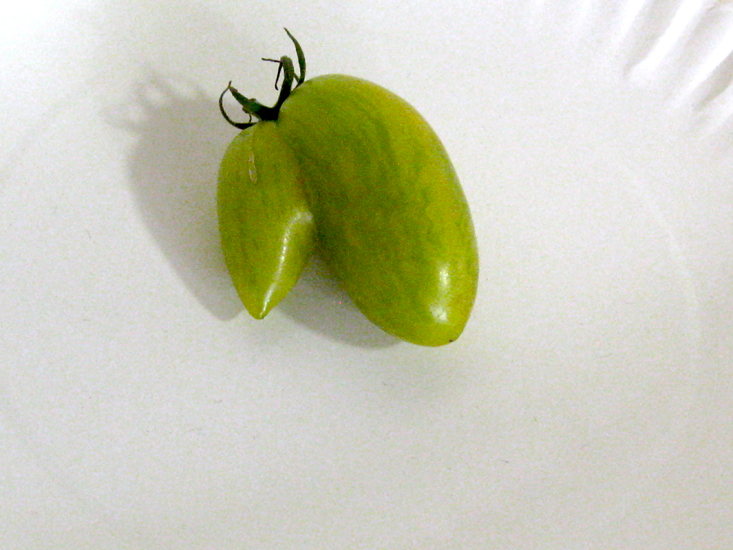
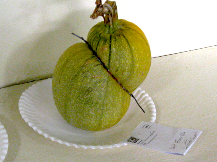
I attended the Ohio State Fair in Columbus, Ohio this year. I really love going to the fair, seeing all the sights, smelling the fragrances and the odors, and watching all the people and animals. Today I will post the photos from the Odd and Natural Growth entries in the fair. These were basically misshapen vegetables. I loved the sign, the presentation on white paper plates and seeing what people thought were odd growth patterns.


more
Beer Label Logo (August 17, 2015)
Recently I created this logo to be used as a label for beer for D.A. Fleischer. He brews his own craft beer and is also a photographer. You can see his work at this link : http://www.da-photo.com/index.html
The name is Zone System Brewery and is based on a a popular photographic technique for determining optimal film exposure. This was called the Zone System and formulated by Ansel Adams. The system is based on dividing the shades of grey from white to black in ten zones.
Brewing beer could also be classified in terms of its darkness or lightness, such as a dark stout or a white beer. Below is the logo.

more
Red Cedars (August 10, 2015)
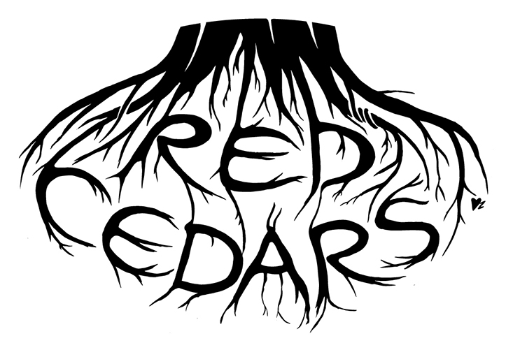
Recently I designed a logo for a local band called Red Cedars. The members are Dinah Devoto and Patrick Kennedy. They play and write old-timey, roots music.
Below I attached a photo of the logo. Red Cedars are trees that are pioneer invaders. This means that it is one of the first trees to repopulate cleared or damaged land. Considering that their music is roots music – I used that idea to design their logo.
To hear their music, you can click this link:
http://loopandlil.bandcamp.com

more
Totem Animal Number 2 (July 31, 2015)
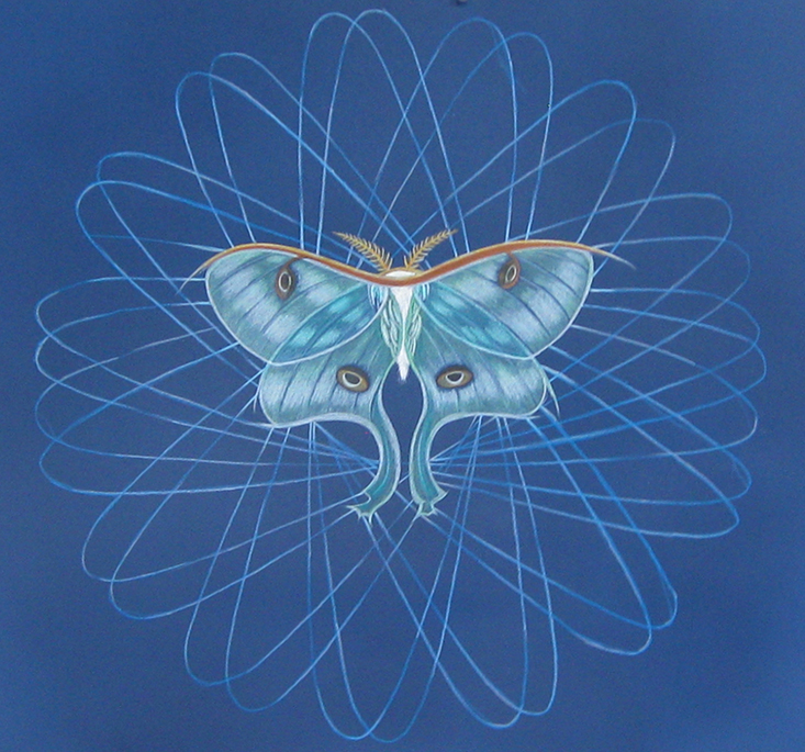
After finishing the owl totem, I wanted to create another animal that spoke to me. I was really affected by the lunar moth that I found and then mounted. That was explained in a very early blog entry in September 19, 2012. I had this great visual resource so I decided to draw a lunar moth. The final image is presented below.

more
Totem Animal Mandala Drawings (July 23, 2015)
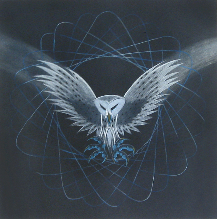
After my collaboration the David Freeman, the mathematician, I began using this geometric spirograph pattern as a backdrop for different totem animals. The first one was a white owl swooping down on prey. You may recall my posting of a barn owl sketch for my niece Kat on January 1, 2015. You can see it by searching back to January in this blog. I liked this sketch and wanted to reproduce it on a black field to give it a more ominous feel. I liked the spirograph in the background as a subtle web or trap. By melding these two images together – I started on this new series of choosing certain totem animals and placing them in some kind of mandala pattern. In this way, these animals become more symbols or totems rather than illustrations. I have posted a photo of it below.

more
Compass Painted on Big Tree Stump (July 15, 2015)
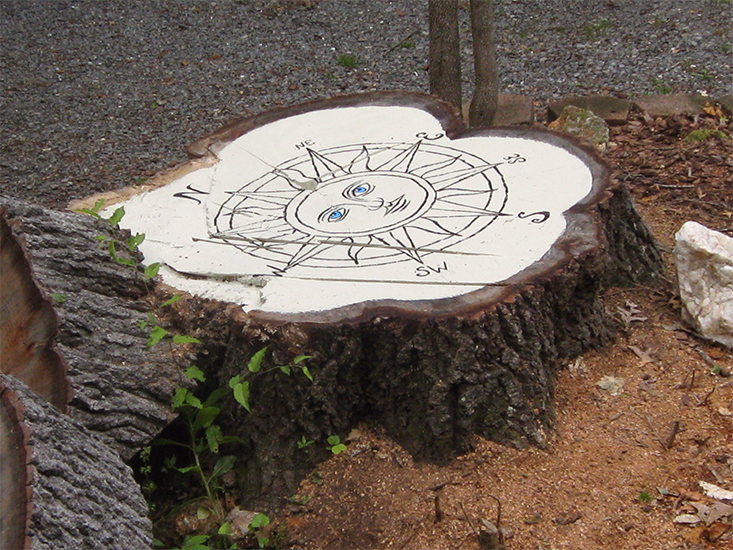
Recently my friend had a huge oak tree taken down in front of their lakehouse property. It left a huge stump that is about 4 feet in diameter. He asked what I thought would be a good creative idea to do with it. His wife suggested that he hollow it out and use it as a planter. However, that would have been a big time-consuming task and did not even know how to go about it so he asked me for alternative ideas. The first thing I thought was that I could burn an image of a compass into the top of the stump. The more I thought about it – I realized that it would be very problematic to actually burn into a new stump and suggested that I could paint the compass on top of the stump.
He agreed that was a good idea and that is what I did – I first put a coat of ivory oil-based enamel on the surface and then painted the details with a black oil-based enamel. I originally was planning on using marine deck paint but the store that normally carrys that paint did not have any so I used the oil-based exterior enamel. I highlighted the eyes with a little blue just to give it some focus and color.
My friend asked me what to do to keep it looking good. I said that he could put some polyurethane over it but instead suggested that he just let it weather and see how it ages. He could always put the polyurethane on later.
I an curious to see how it weathers. It was challenging to paint the details on because the top surface was not flat – it had a lot of ridges and parts of the stump sticking up further than others.
I have posted a photo of it below. It was hard to get far enough above it to take this shot.

more
Collaboration with Mathematician continued again. (July 8, 2015)
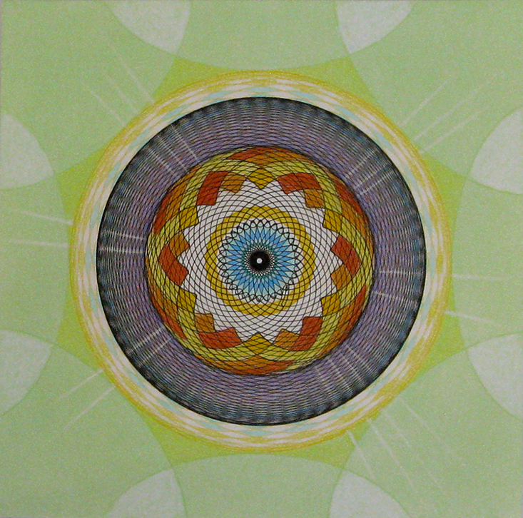
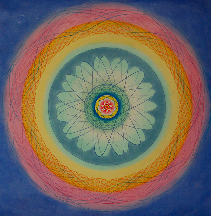
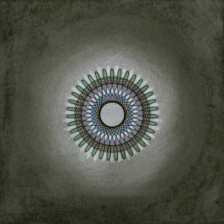
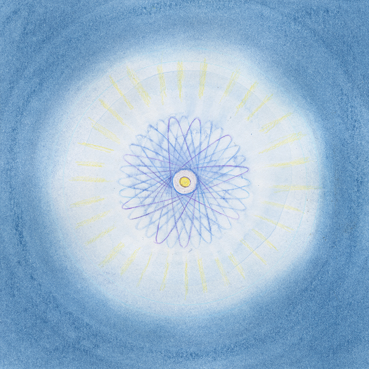
The last collaborations we created were started by David Freeman and then finished by me. These last two images are fourteen inch square. We started off small with four six inch squares, then moved on to two forty-two inch squares and finished with two fourteen inch squares. The last two are pictured below.


more
Collaboration with Mathematician continued (June 30, 2015)
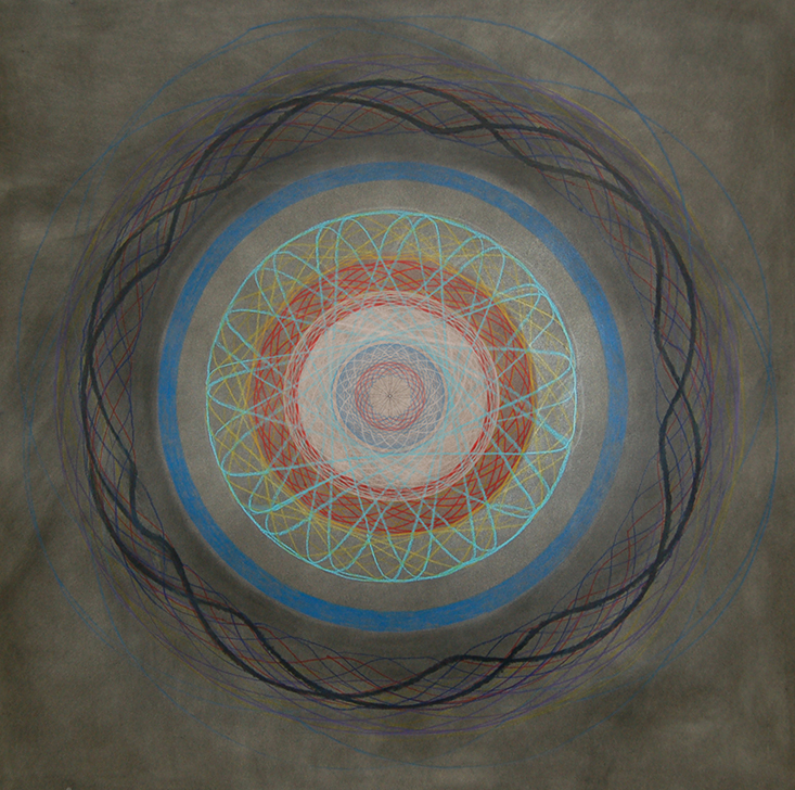
Below are the two artworks we collaborated on that are 42 inch square. I wanted to create some very large works in order to take it outside the realm of the small spirograph images that is associated with the toy. I started the large works and then handed them off to David Freeman to finish.


more
Collaboration with Mathematician (June 25, 2015)
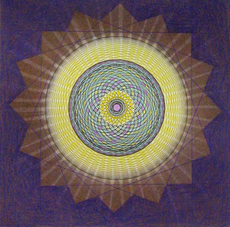
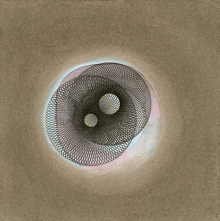
Over the winter I collaborated with David Freeman on a series of eight different art pieces. David is a mathematician and we worked together creating what we call ‘approximations’ to illustrate abstract notions of space, time and mathematical constructs. We ended up creating a whole lot of spirographs that ranged from 6 inch square to 14 inch square to 42 inch square. Sometimes I would start the piece and then hand it off to David to finish, sometimes the opposite was true. I have posted the first four small pieces below. The first three of these pieces will be shown in July at the Mathematical Art gallery show as part of the 2015 Bridges Conference.
Here is a link to the exhibit: http://gallery.bridgesmathart.org/exhibitions/2015-bridges-conference/davidmfreeman


more
